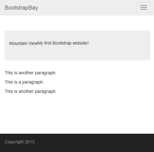
I have started to develop a prototype for what my project might look like. Using bootstrap, I have created a basic responsive website with drop down menus.
Once the window is minimized enough, it takes on mobile form:
A few further developments with panels underneath the jumbotron (‘Bootstrap pets’) box.
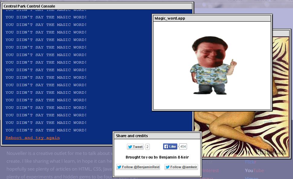
It’s a terminal that you can interact with. You must ‘type help for command list’. Once done, you are given the commands: help, status, reboot, moff, trex. When you type any one of the commands, it opens up a tab to a different webpage unrelated to the command.
I like this out of the box thinking for a 404 page, because they usually go unnoticed. I’m also interested in the unexpected link that opens up once you type into the terminal. This also has a similar feel to http://wwwwwwww.jodi.org/ and the skrillex example I used in my previous blog post.
This happens when you don’t type in the right command after a few goes:
Ikea stores are designed in a one-way system, leading customers counter clockwise along what IKEA calls “the long natural way”. It is designed to make the customer see the store in its entirety, as opposed to a normal store, like B&Q, where you can move freely from one second to another with no linear form. Although, there are sometimes subtle shortcuts to other parts of the store.
What interests me about Ikea’s layout is the one way system almost forced on the customs. Once a custom enters the building, they don’t have any other clear option other than to make their way to the other side of the building to leave, unless they find the subtle shortcuts.
In context to my web-based project, I’d like to implement this one way system in a website, similar to the Skrillex and http://wwwwwwww.jodi.org/ examples.
My first rough idea is to create a website that exaggerates how consumerism effects personal identities. For example, a person moves through the website by clicking ‘buy’ and ‘don’t buy’ and satirized items. The further you move through the site, the more ridiculous the items become. At some point you’re not allowed to click ‘don’t buy’ as if you’re forced to consume.
There are lots of examples for satirized brands in GTA VI:
Something I’ve been interested in is the idea of having an immersive journey though a website. We only use websites to serve a purpose. I really like the idea of a website being a random journey where you can choose where you go, like a game with alternative endings. For example, you’re on the home page and you have five options to click on, each brings you into a different world/story.
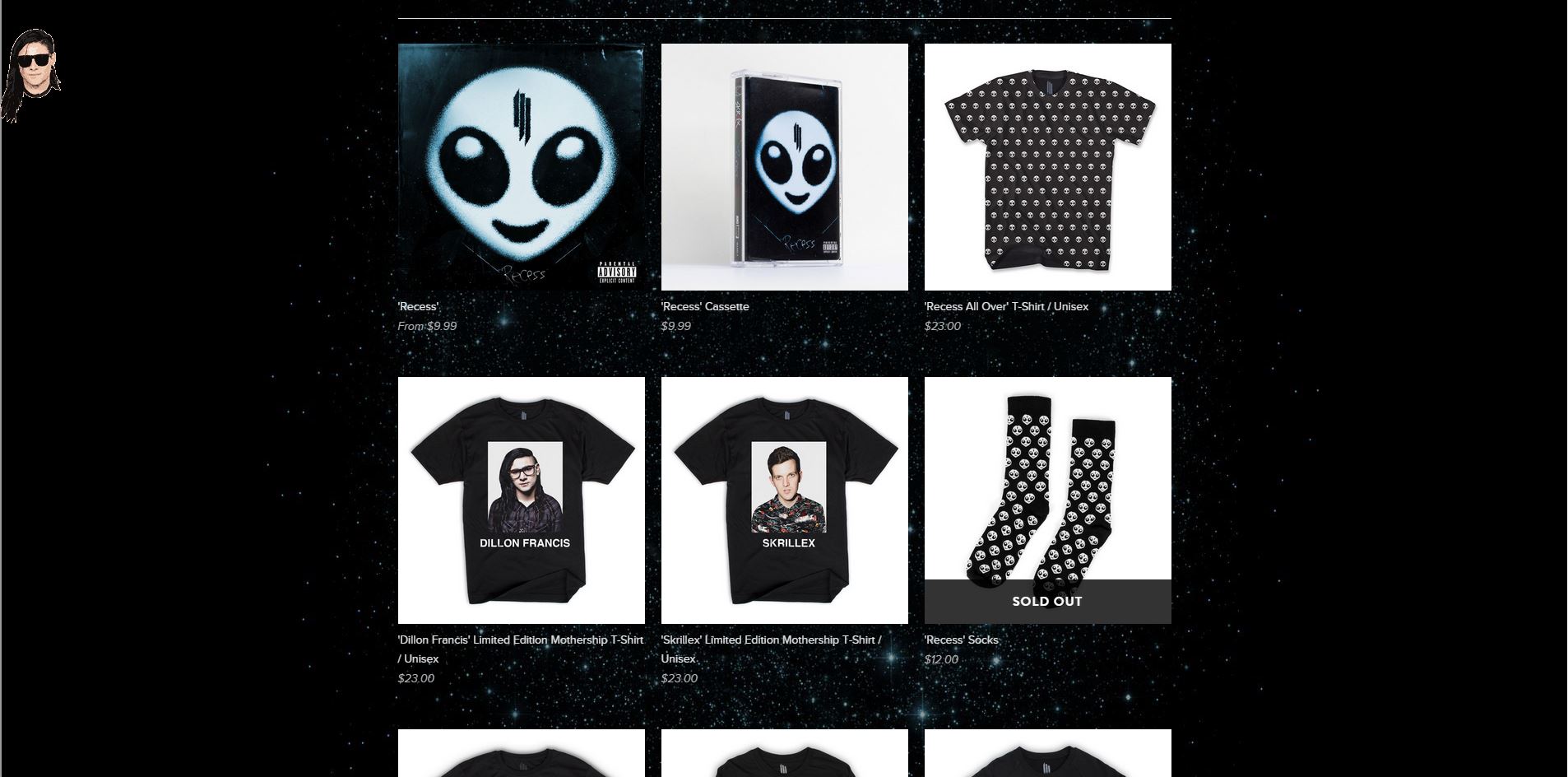
There is a music producer who goes by the name of Skrillex who made a project to promote his clothing merchandise. On the home page, you can see an unusual looking desktop where you are given several links to click on that take you into another incoherent route.
The pages seem endless but at some point without realising what you’ve actually clicked on, you end on the mechendise website.
And eventually ending up at the merchandise page
I like this idea, but this it would be more interesting to put a story line in the journey. Being able to pick you’re own journey with alternative endings would encourage people to come back and experience the website again.


![life%20invader[1]](https://conorintensiveproduction.wordpress.com/wp-content/uploads/2015/01/life20invader1.png)